 Master CAWEB
 Green Web Design Trends: “Ultra-Minimalist Navigation” and the Return of Static Websites
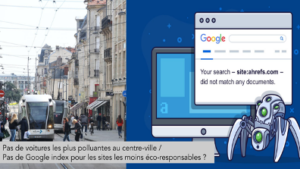
Eco-design has become a major concern in terms of ecology and the environment. “Faster, more efficient” has become Google’s motto. In order to help you in your efforts to make your website greener, there are two other web design trends that can be mentioned that fall into the same green category as “mobile first” and dark mode. We will name it: ultra-minimalist navigation and the return of static sites.
Ultra-Minimalist Navigation
Ultra-minimalist navigation: “Many mobile applications have undergone an increasingly minimalist redesign in recent years. Not only the visual rendering, but also the way it works, has been simplified. In a connected world where “simple” has become a way of thinking for any approach, ultra-minimalism seems to be taking over after flat design and minimalist design. ”
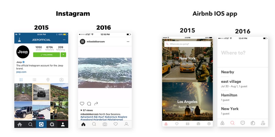
In concrete terms, four notable applications have helped to spread this trend: Instagram, Apple Music, Airbnb and Medium. When opening the interface of these four applications, it is easy to notice some common points: a “tab system” menu (represented by five icons at the bottom of the page with the most important functionalities), simple icons, limited use of colours, and the simplicity of the typography, which reinforces the readability of the essential texts.
In short, only the essentials!
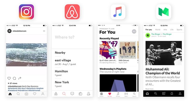
Picture taken from Medium
On closer look, their ultra-minimalist style is the result of an evolution over the last few years. In 2016, the Instagram application underwent an overhaul of its UI design. It greatly simplified the visual rendering of the interface while leaving room for the most important action of the application for the user –posting photos online. Same for Airbnb: they decided to eliminate the use of large photos, as well as an integrated search bar on the top, in favour of a full white search page that is both simpler and clearer for the user.
Picture taken from Medium
As written in « Eco-conception web : les 115 bonnes pratiques : Doper son site et réduire son empreinte écologique », (“Eco-Web Design: 115 Good Practices: Boost Your Site and Reduce Your Ecological Footprint”), if the framework of the project allows it, you should favour a simple, sleek design adapted to the web, and in particular exploit the functionalities of HTML5 and CSS3 to design a site, instead of putting images directly on it : “Suggest the use of colour gradients, a style of rounded corners, etc. which can be done in CSS3, instead of requiring images.[…] Create banners, headers, etc. so that the text, coloured backgrounds, etc. can be created in HTML/CSS.” Compared to images, a piece of CSS code is relatively light, so it consumes less energy when loading, displaying, and also in its storage process.
At the beginning of the twentieth century, René Char, a French poet and resistance fighter, had already written this saying: “The essential is constantly threatened by the insignificant.” In fact, in 2015, Google robots had already started indexing about 130 trillion pages. A little reminder: a trillion means a billion billion (or 1018)! That is why by taking into account this incredible figure we can understand why it’s so important to pay attention to the smaller parts of a website’s design. A sleek design can help change the world. We also can’t forget that extremely minimalist navigation bars also improve functionality and the user experience because “the less time the user spends finding what they are looking for, the more time they will spend on the site in question, going from page to page instead of wondering how to get from page to page.”
The Return of Static Sites
The latest ecological trend in web design concerns the return of static websites and their common application in One Page websites. A static website has simply three major advantages:
- Simplicity to make it safe,
- Loading speed,
- And in general a low production cost since its technically less difficult.
The combination of static and One Page websites is the result of the fact that the design of One Page is specifically intended for mobile phone navigation. A One Page site allows mobile phone users to scroll quickly through one and only page. This practice is especially suitable for small projects, such as an individual’s portfolio, the showcase page of a small service agency, etc. To achieve this speed objective, a static page that loads efficiently is undoubtedly the best choice. On the other hand, for a larger project, if the content of a page does not need to be displayed dynamically with the help of user requests, a simple static page is also a good choice.
Even if static pages are the opposite of another trend, which is to always have more animation on a website, their return does not mean depriving them of all the interactions that strengthen the link with the user. On the other hand, the use of well-chosen micro animations can attract the user’s attention and thus make the page attractive enough, without it needing to be dynamic. For example, “When he slides his finger over it, when he ticks a button, the colours change, windows open… Something must happen as soon as an action is performed…”
The choice between ‘having more and more animated elements’ and ‘going back to static pages’ leads us, once again, to consider how much and what kind of content to have on a website. While being aware that everything that is superfluous will lead to a waste in energy, the return to static pages is therefore not so surprising for users who are becoming increasingly aware of digital pollution.
Written by Shu-Min Huang